
Google Industry Project: Accessibility in Healthcare
Towards the end of July 2022, I had the pleasure of working alongside a very talented team of web developers, UX designers and fellow data scientists to compete in a hackathon/industry project hosted by Brainstation, in collaboration with Google. Our problem space was to come up with digital solutions to improving access or accessibility to healthcare, and we had 24 hours to present our MVP.
Our initial research looked at various barriers to accessing healthcare, one of them being mobility disabilities that hinder an individual’s ability to travel to receive treatment. Our solution was branded Google Homecare, an app designed to connect patients with medical professionals willing to travel.
As one of the data science team members, my role was to compile relevant insights on the state of healthcare and accessibility to healthcare using data from various public sources such as the US Census and Homeland infrastructure. These insights are then used to inform the UX team on how to design our user persona.
Using Plotly and a Homeland dataset on the locations of 7000 unique hospitals throughout the states, I was able to create the choropleth map below:
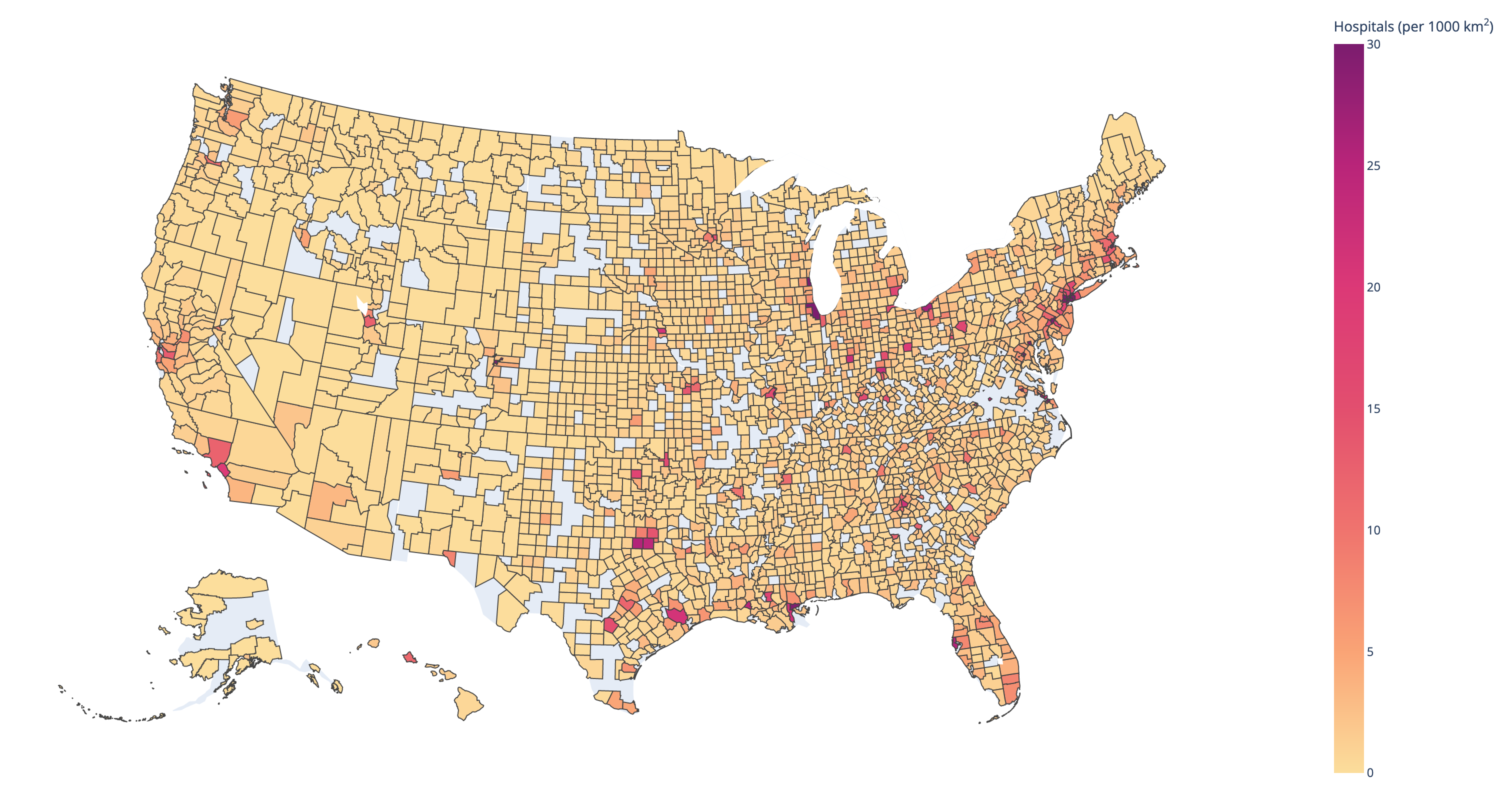
Nearly 57% of the United States has less than 1 hospital per 1000 square kilometers.
It was grueling 24 hours, most of which was me waiting for API calls, but it was a lot of fun, and we were proud to present our solution to our judges from Google. They were so impressed we ended up winning the event! My first hackathon win!
If you’re interested in seeing more of our project, I have our slides saved here. I can’t praise our UX and web dev team members enough, they really put in a metric ton of work to make our product look so good, you wouldn’t know it was made in under 24 hours.